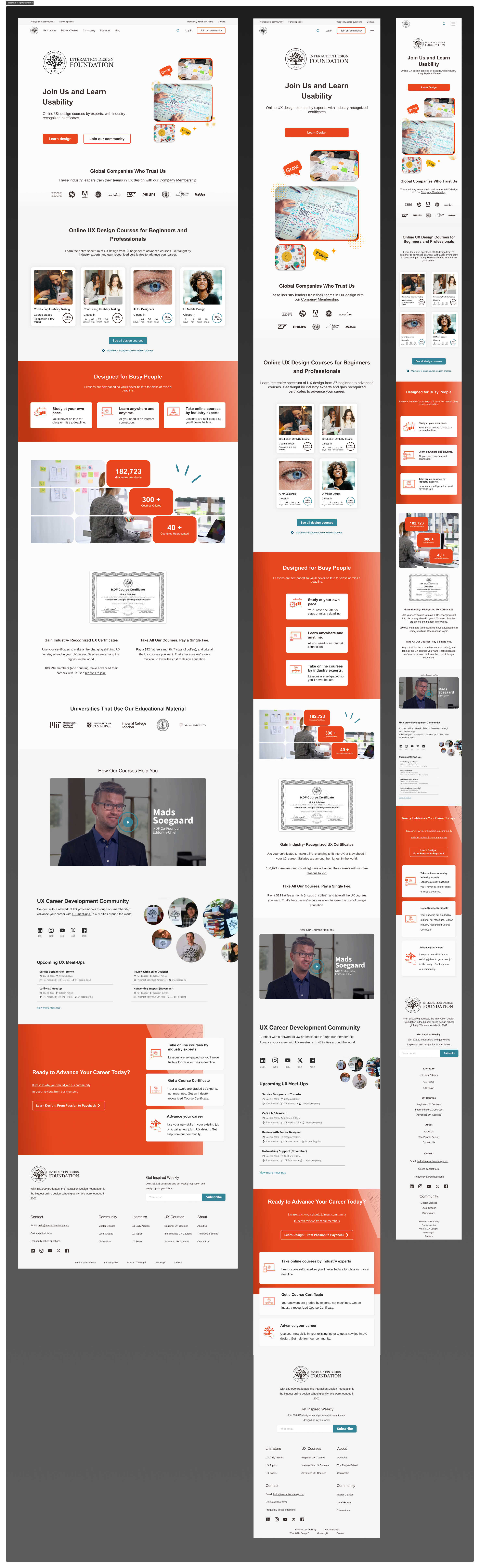
The redesign prioritized simplicity with a clean layout that minimized distractions and focused on core messaging. Modern design elements established trust and credibility, while strategically placed CTAs encouraged conversions.
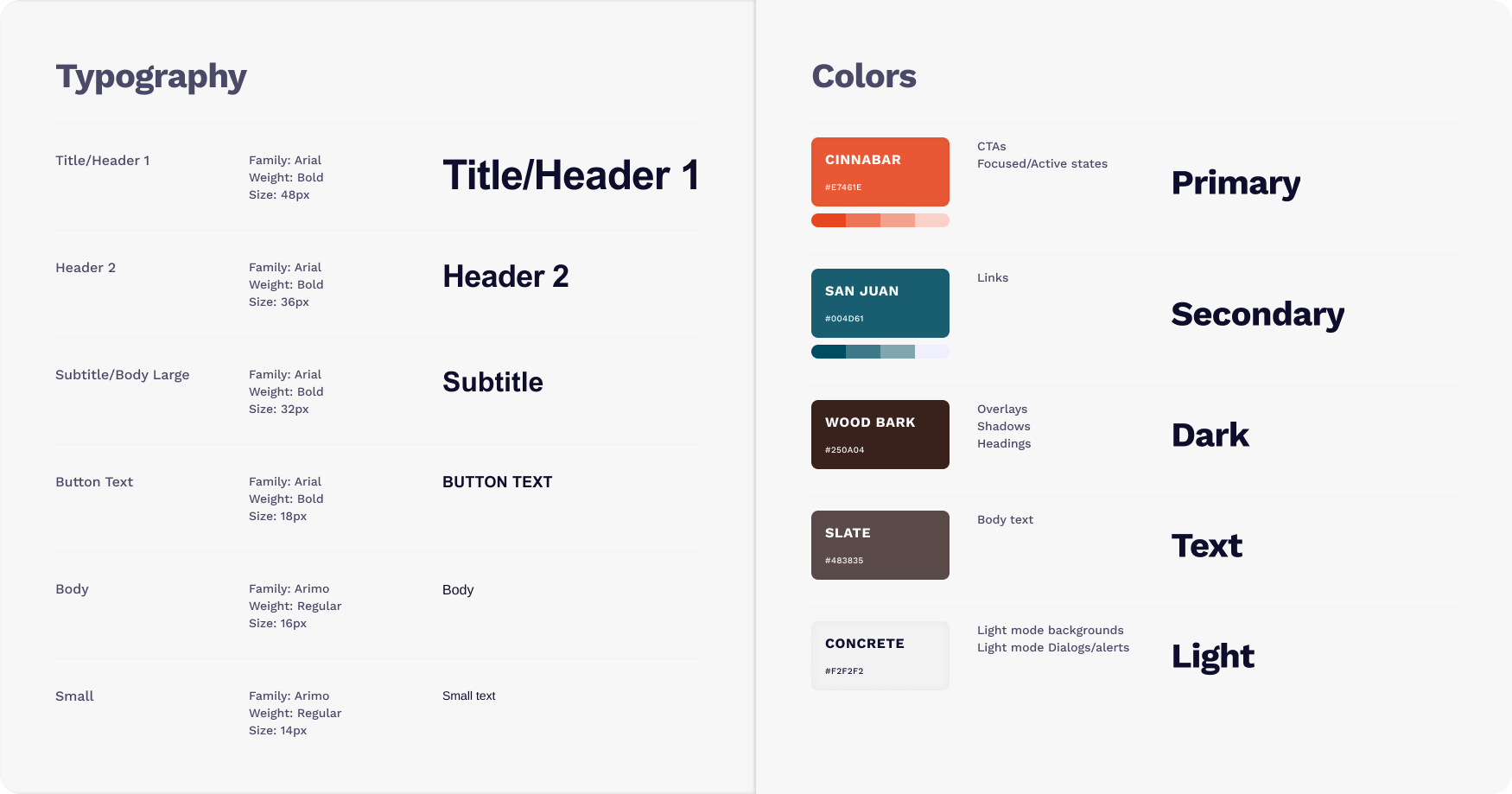
The color scheme used a white and neutral base to create a clean and professional look, while an orange accent color was applied to CTAs and important sections to draw attention.
The updated hero section featured a bold header with a clear CTA button (“Learn Design”) to immediately draw attention. Trusted brands were prominently displayed via global company logos to boost credibility. Highlighted courses with visuals provided quick access to popular learning opportunities. Responsive design ensured a seamless experience across desktop, tablet, and mobile devices.
Improved navigation with clear menu options and intuitive scrolling guided users through the page. Key elements like certifications, testimonials, and CTAs were prominently displayed to maintain a clear visual hierarchy.